

Performanze.
“Sorry. Warning. Anxiety Vibes.”
So... our design, our product, our
life, even our breathing has to be
decisive, informative, and
flexible ;)


The concept
As a founding principle, Performanze's identity is built on the concept of its purpose: optimization and results. Everything in the visual system responds to this logic.
The concept
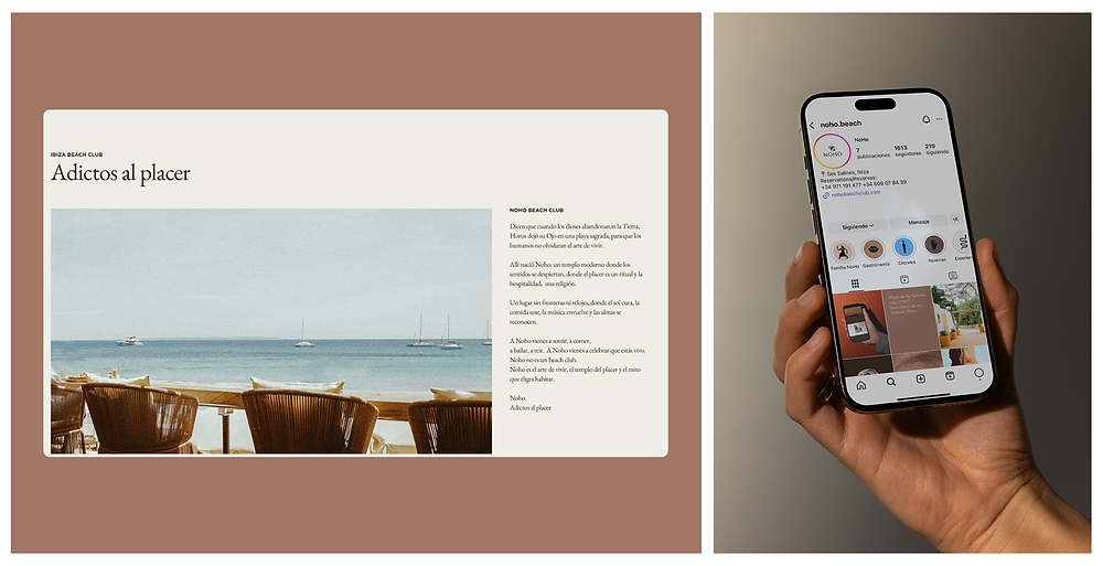
They say that when the gods abandoned Earth, Horus left his Eye on a sacred beach, so that humans would not forget the art of living. There, Noho was born: a modern temple where the senses are awakened, where pleasure is a ritual and hospitality is a religion.


Web design
A website with a new visual identity. Opting for a brutalist approach, the redesign dispenses with unnecessary embellishments to focus on the essentials: structure, contrast, and content. The raw and direct aesthetic improves readability and restores functionality as the central focus. The limitations of the previous version are corrected with a clearer, more accessible, and visually striking interface.


Moodboard
We drew inspiration from images of brutalist designs. A brand with visual credibility, a brand that does not seduce with aesthetics but convinces with data. Raw numbers, without embellishment. Structured graphics with hard lines and direct typography. Nothing is superfluous: the data is shown as it is, clear and impossible to ignore.

Application of corporate image
The corporate image is integrated into the design with firmness and consistency. Each graphic element maintains a strong presence, without unnecessary aesthetic concessions. The identity is reinforced through rigid compositions and visual repetition, aligning with the principles of digital brutalism: clarity, structure, and authenticity.


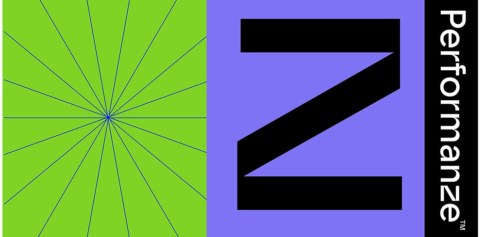
Iconography and graphic resources
We use abstract symbols, geometric shapes, and vector textures, which provide visual diversity without compromising structural rigor. The use of resources such as kinetic lines, patterns, or color blocks adds visual rhythm without overwhelming the viewer. Simple, bold, and brutalist.


The Answer
The solution is based on a clear and uncompromising visual architecture. Superfluous elements have been eliminated to make way for a functional interface, where each element serves a purpose. Information is presented in a hierarchical and direct manner, with bold typography, contrasting colors, and rigid structures. This new proposal not only improves accessibility and comprehension of the content, but also reinforces an honest, consistent visual identity with character.


Favicon
The distinctive feature is the final “Z,” treated as an identifying symbol. The last letter of the alphabet, it functions conceptually as a resounding conclusion—and formally as a strong graphic element that can be isolated as a secondary brand or visual seal (the fox's signature. A signature that
evokes agility, cunning, speed, and mischief with social benefit).

Creativity for Performanze.
Services
Creative concept.
Art direction.
Brand Identity.
Web design.
A project in
collaboration with:
Client:
Performanze
Creative Executive director and Art Direction:
Elena García Menéndez
Director of Customer Services and Communication:
Cecilia Ortiz
Graphic designer:
Noann Moreno
Web designer:
Kiko Peláez